Tooltip
Basic Tooltip

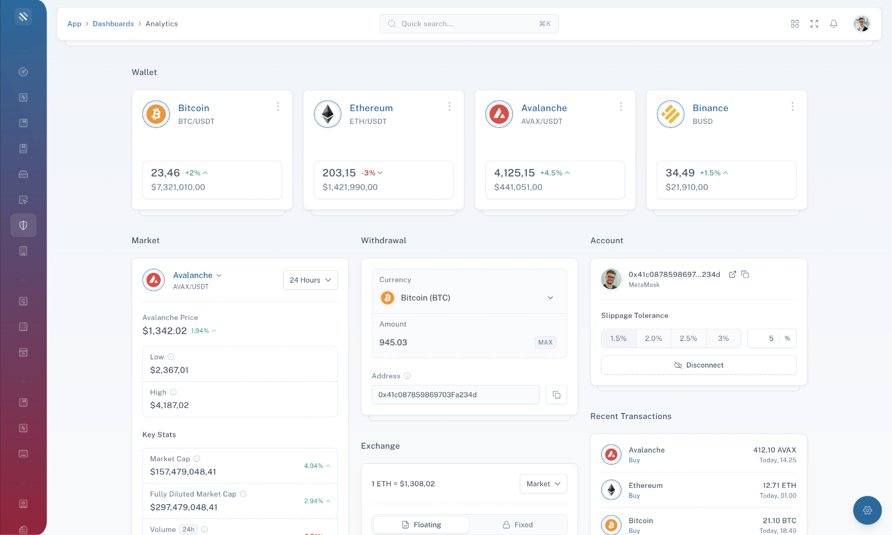
Tooltips are a helpful way to provide additional information or descriptions for elements on a web page. They typically appear when users hover over or interact with an element, offering context and clarification. This section explains how to implement basic tooltips in your web application.

Example code / preview
            
                HTMLOpenTagdiv class="text-center"HTMLCloseTag
                                                    HTMLOpenTagbutton
    data-tw-merge
    data-placement="top" title="This is awesome tooltip example!" class="transition duration-200 border shadow-sm inline-flex items-center justify-center py-2 px-3 rounded-md font-medium cursor-pointer focus:ring-4 focus:ring-primary focus:ring-opacity-20 focus-visible:outline-none dark:focus:ring-slate-700 dark:focus:ring-opacity-50 [&:hover:not(:disabled)]:bg-opacity-90 [&:hover:not(:disabled)]:border-opacity-90 [&:not(button)]:text-center disabled:opacity-70 disabled:cursor-not-allowed bg-primary border-primary text-white dark:border-primary tooltip cursor-pointer tooltip cursor-pointer"
HTMLCloseTagShow TooltipHTMLOpenTag/buttonHTMLCloseTag
                                                HTMLOpenTag/divHTMLCloseTag


The "Basic Tooltip" section has demonstrated how to use tooltips to provide additional information and hints to users when they interact with elements on your web page. By following these guidelines and best practices, you can enhance user experience and provide valuable context without overwhelming your UI.

On Click Tooltip

An "On Click Tooltip" is a variation of the traditional tooltip that appears when the user clicks on an element rather than hovering over it. This section explains how to implement tooltips that appear on click events in your web application.

Example code / preview
            
                HTMLOpenTagdiv class="text-center"HTMLCloseTag
                                                    HTMLOpenTagbutton
    data-tw-merge
    data-placement="top" title="This is awesome tooltip example!" data-trigger="click" class="transition duration-200 border shadow-sm inline-flex items-center justify-center py-2 px-3 rounded-md font-medium cursor-pointer focus:ring-4 focus:ring-primary focus:ring-opacity-20 focus-visible:outline-none dark:focus:ring-slate-700 dark:focus:ring-opacity-50 [&:hover:not(:disabled)]:bg-opacity-90 [&:hover:not(:disabled)]:border-opacity-90 [&:not(button)]:text-center disabled:opacity-70 disabled:cursor-not-allowed bg-primary border-primary text-white dark:border-primary tooltip cursor-pointer tooltip cursor-pointer"
HTMLCloseTagShow TooltipHTMLOpenTag/buttonHTMLCloseTag
                                                HTMLOpenTag/divHTMLCloseTag


The "On Click Tooltip" section has demonstrated how to use tooltips that appear when the user clicks on elements in your web application. By following these guidelines and best practices, you can provide additional information and context to your users when they need it, improving the overall user experience.

Light Tooltip

A "Light Tooltip" is a type of tooltip that provides additional information when the user hovers over an element. These tooltips are designed with a clean and minimalistic appearance. This section explains how to implement Light Tooltips in your web application.

Example code / preview
            
                HTMLOpenTagdiv class="text-center"HTMLCloseTag
                                                    HTMLOpenTagbutton
    data-tw-merge
    data-placement="top" title="This is awesome tooltip example!" data-theme="light" class="transition duration-200 border shadow-sm inline-flex items-center justify-center py-2 px-3 rounded-md font-medium cursor-pointer focus:ring-4 focus:ring-primary focus:ring-opacity-20 focus-visible:outline-none dark:focus:ring-slate-700 dark:focus:ring-opacity-50 [&:hover:not(:disabled)]:bg-opacity-90 [&:hover:not(:disabled)]:border-opacity-90 [&:not(button)]:text-center disabled:opacity-70 disabled:cursor-not-allowed bg-primary border-primary text-white dark:border-primary tooltip cursor-pointer tooltip cursor-pointer"
HTMLCloseTagShow TooltipHTMLOpenTag/buttonHTMLCloseTag
                                                HTMLOpenTag/divHTMLCloseTag


The "Light Tooltip" section has demonstrated how to use tooltips that provide additional information when the user hovers over elements in your web application. By following these guidelines and best practices, you can enhance user understanding and improve the overall user experience.

Custom Tooltip Content

Custom Tooltip Content allows you to create tooltips with personalized and dynamic information. Instead of using static text, you can populate tooltips with dynamic content such as images, icons, or even React components. This section explains how to implement Custom Tooltip Content in your web application.

Example code / preview
Tailwise - Admin Dashboard Template
Cate Blanchett
TailwindCSS 3+ HTML Admin Template
            
                HTMLOpenTag!-- BEGIN: Custom Tooltip Toggle --HTMLCloseTag
                                                HTMLOpenTagdiv class="text-center"HTMLCloseTag
                                                    HTMLOpenTagbutton
    data-tw-merge
    data-tooltip="custom-tooltip-content" class="transition duration-200 border shadow-sm inline-flex items-center justify-center py-2 px-3 rounded-md font-medium cursor-pointer focus:ring-4 focus:ring-primary focus:ring-opacity-20 focus-visible:outline-none dark:focus:ring-slate-700 dark:focus:ring-opacity-50 [&:hover:not(:disabled)]:bg-opacity-90 [&:hover:not(:disabled)]:border-opacity-90 [&:not(button)]:text-center disabled:opacity-70 disabled:cursor-not-allowed bg-primary border-primary text-white dark:border-primary"
HTMLCloseTagShow TooltipHTMLOpenTag/buttonHTMLCloseTag
                                                HTMLOpenTag/divHTMLCloseTag
                                                HTMLOpenTag!-- END: Custom Tooltip Toggle --HTMLCloseTag
                                                HTMLOpenTag!-- BEGIN: Custom Tooltip Content --HTMLCloseTag
                                                HTMLOpenTagdiv class="tooltip-content"HTMLCloseTag
                                                    HTMLOpenTagdiv
    id="custom-tooltip-content"
    class="tippy-content"
HTMLCloseTag
    HTMLOpenTagdiv class="relative flex items-center py-1"HTMLCloseTag
                                                            HTMLOpenTagdiv class="image-fit h-12 w-12"HTMLCloseTag
                                                                HTMLOpenTagimg
                                                                    class="rounded-full"
                                                                    src="dist/images/products/product2-400x400.jpg"
                                                                    alt="Tailwise - Admin Dashboard Template"
                                                                HTMLCloseTag
                                                            HTMLOpenTag/divHTMLCloseTag
                                                            HTMLOpenTagdiv class="ml-4 mr-auto"HTMLCloseTag
                                                                HTMLOpenTagdiv
                                                                    class="whitespace-nowrap font-medium leading-normal dark:text-slate-200"HTMLCloseTag
                                                                    Cate Blanchett
                                                                HTMLOpenTag/divHTMLCloseTag
                                                                HTMLOpenTagdiv
                                                                    class="mt-0.5 whitespace-nowrap text-xs text-slate-500 dark:text-slate-400"HTMLCloseTag
                                                                    TailwindCSS 3+ HTML Admin Template
                                                                HTMLOpenTag/divHTMLCloseTag
                                                            HTMLOpenTag/divHTMLCloseTag
                                                        HTMLOpenTag/divHTMLCloseTagHTMLOpenTag/divHTMLCloseTag
                                                HTMLOpenTag/divHTMLCloseTag
                                                HTMLOpenTag!-- END: Custom Tooltip Content --HTMLCloseTag


The "Custom Tooltip Content" section has demonstrated how to create tooltips with personalized and dynamic content, allowing you to provide users with richer and context-specific guidance. By leveraging this feature, you can enhance the overall user experience and usability of your web application.

Chart Tooltip

Chart tooltips are an essential component of data visualization, providing users with valuable insights when interacting with charts and graphs. This section explains how to implement and customize chart tooltips in your web application.

Example code / preview
Net Worth
USP: +23%
            
                HTMLOpenTag!-- BEGIN: Custom Tooltip Toggle --HTMLCloseTag
                                                HTMLOpenTagdiv class="text-center"HTMLCloseTag
                                                    HTMLOpenTagbutton
    data-tw-merge
    data-tooltip="chart-tooltip" class="transition duration-200 border shadow-sm inline-flex items-center justify-center py-2 px-3 rounded-md font-medium cursor-pointer focus:ring-4 focus:ring-primary focus:ring-opacity-20 focus-visible:outline-none dark:focus:ring-slate-700 dark:focus:ring-opacity-50 [&:hover:not(:disabled)]:bg-opacity-90 [&:hover:not(:disabled)]:border-opacity-90 [&:not(button)]:text-center disabled:opacity-70 disabled:cursor-not-allowed bg-primary border-primary text-white dark:border-primary"
HTMLCloseTagShow TooltipHTMLOpenTag/buttonHTMLCloseTag
                                                HTMLOpenTag/divHTMLCloseTag
                                                HTMLOpenTag!-- END: Custom Tooltip Toggle --HTMLCloseTag
                                                HTMLOpenTag!-- BEGIN: Custom Tooltip Content --HTMLCloseTag
                                                HTMLOpenTagdiv class="tooltip-content"HTMLCloseTag
                                                    HTMLOpenTagdiv
    id="chart-tooltip"
    class="tippy-content py-1 py-1"
HTMLCloseTag
    HTMLOpenTagdiv class="font-medium dark:text-slate-200"HTMLCloseTag
                                                            Net Worth
                                                        HTMLOpenTag/divHTMLCloseTag
                                                        HTMLOpenTagdiv class="mt-2 flex items-center sm:mt-0"HTMLCloseTag
                                                            HTMLOpenTagdiv class="mr-2 flex w-20 dark:text-slate-400"HTMLCloseTag
                                                                USP:
                                                                HTMLOpenTagspan class="ml-auto font-medium text-success"HTMLCloseTag
                                                                    +23%
                                                                HTMLOpenTag/spanHTMLCloseTag
                                                            HTMLOpenTag/divHTMLCloseTag
                                                            HTMLOpenTagdiv class="w-24 sm:w-32 lg:w-56"HTMLCloseTag
                                                                HTMLOpenTagdiv class="w-auto h-[30px]"HTMLCloseTag
    HTMLOpenTagcanvas
    class="chart simple-line-chart-1 simple-line-chart-1"
HTMLCloseTagHTMLOpenTag/canvasHTMLCloseTag
HTMLOpenTag/divHTMLCloseTag
                                                            HTMLOpenTag/divHTMLCloseTag
                                                        HTMLOpenTag/divHTMLCloseTagHTMLOpenTag/divHTMLCloseTag
                                                HTMLOpenTag/divHTMLCloseTag
                                                HTMLOpenTag!-- END: Custom Tooltip Content --HTMLCloseTag


The "Chart Tooltip" section has demonstrated how to create and customize tooltips for your charts and data visualizations. By implementing well-designed chart tooltips, you can provide users with valuable insights, enhance their understanding of the data, and improve overall user engagement.

Component API

In this section, you will find detailed information about the available props, classes, and options that can be used with the component. Understanding these properties is essential for customizing and configuring the component to suit your specific requirements.

Below is a list of props that can be passed to the component:

Tippy
Prop Type Description
`getRef` `(el: PopperElement | null) => void` A function to get a reference to the PopperElement or null
`content` `string` The content to display in the tooltip
`as` `string` The HTML element type or React component to render
`options` `Props` Additional options for customizing the tooltip appearance and behavior
TippyContent
Prop Type Description
`to` `string` The target element selector for which the tooltip will be displayed (using the data-tooltip attribute)
`getRef` `(el: HTMLElement | null) => HTMLElement` A function to get a reference to the tooltip element or null
`options` `Props` Additional options for customizing the tooltip appearance and behavior