Buttons
Basic Buttons

Buttons are fundamental elements in web and app design, allowing users to interact with your content and perform actions. The Basic Buttons component provides a range of button styles that you can easily incorporate into your project. These buttons come in various color variants to suit your design needs.

Example code / preview
            
                HTMLOpenTagdiv class="flex flex-wrap gap-2"HTMLCloseTag
                                                    HTMLOpenTagbutton
    data-tw-merge
    class="transition duration-200 border shadow-sm inline-flex items-center justify-center py-2 px-3 rounded-md font-medium cursor-pointer focus:ring-4 focus:ring-primary focus:ring-opacity-20 focus-visible:outline-none dark:focus:ring-slate-700 dark:focus:ring-opacity-50 [&:hover:not(:disabled)]:bg-opacity-90 [&:hover:not(:disabled)]:border-opacity-90 [&:not(button)]:text-center disabled:opacity-70 disabled:cursor-not-allowed bg-primary border-primary text-white dark:border-primary w-24 w-24"
HTMLCloseTagPrimaryHTMLOpenTag/buttonHTMLCloseTag
                                                    HTMLOpenTagbutton
    data-tw-merge
    class="transition duration-200 border shadow-sm inline-flex items-center justify-center py-2 px-3 rounded-md font-medium cursor-pointer focus:ring-4 focus:ring-primary focus:ring-opacity-20 focus-visible:outline-none dark:focus:ring-slate-700 dark:focus:ring-opacity-50 [&:hover:not(:disabled)]:bg-opacity-90 [&:hover:not(:disabled)]:border-opacity-90 [&:not(button)]:text-center disabled:opacity-70 disabled:cursor-not-allowed bg-secondary/70 border-secondary/70 text-slate-500 dark:border-darkmode-400 dark:bg-darkmode-400 dark:text-slate-300 [&:hover:not(:disabled)]:bg-slate-100 [&:hover:not(:disabled)]:border-slate-100 [&:hover:not(:disabled)]:dark:border-darkmode-300/80 [&:hover:not(:disabled)]:dark:bg-darkmode-300/80 w-24 w-24"
HTMLCloseTagSecondaryHTMLOpenTag/buttonHTMLCloseTag
                                                    HTMLOpenTagbutton
    data-tw-merge
    class="transition duration-200 border shadow-sm inline-flex items-center justify-center py-2 px-3 rounded-md font-medium cursor-pointer focus:ring-4 focus:ring-primary focus:ring-opacity-20 focus-visible:outline-none dark:focus:ring-slate-700 dark:focus:ring-opacity-50 [&:hover:not(:disabled)]:bg-opacity-90 [&:hover:not(:disabled)]:border-opacity-90 [&:not(button)]:text-center disabled:opacity-70 disabled:cursor-not-allowed bg-success border-success text-slate-900 dark:border-success w-24 w-24"
HTMLCloseTagSuccessHTMLOpenTag/buttonHTMLCloseTag
                                                    HTMLOpenTagbutton
    data-tw-merge
    class="transition duration-200 border shadow-sm inline-flex items-center justify-center py-2 px-3 rounded-md font-medium cursor-pointer focus:ring-4 focus:ring-primary focus:ring-opacity-20 focus-visible:outline-none dark:focus:ring-slate-700 dark:focus:ring-opacity-50 [&:hover:not(:disabled)]:bg-opacity-90 [&:hover:not(:disabled)]:border-opacity-90 [&:not(button)]:text-center disabled:opacity-70 disabled:cursor-not-allowed bg-warning border-warning text-slate-900 dark:border-warning w-24 w-24"
HTMLCloseTagWarningHTMLOpenTag/buttonHTMLCloseTag
                                                    HTMLOpenTagbutton
    data-tw-merge
    class="transition duration-200 border shadow-sm inline-flex items-center justify-center py-2 px-3 rounded-md font-medium cursor-pointer focus:ring-4 focus:ring-primary focus:ring-opacity-20 focus-visible:outline-none dark:focus:ring-slate-700 dark:focus:ring-opacity-50 [&:hover:not(:disabled)]:bg-opacity-90 [&:hover:not(:disabled)]:border-opacity-90 [&:not(button)]:text-center disabled:opacity-70 disabled:cursor-not-allowed bg-pending border-pending text-white dark:border-pending w-24 w-24"
HTMLCloseTagPendingHTMLOpenTag/buttonHTMLCloseTag
                                                    HTMLOpenTagbutton
    data-tw-merge
    class="transition duration-200 border shadow-sm inline-flex items-center justify-center py-2 px-3 rounded-md font-medium cursor-pointer focus:ring-4 focus:ring-primary focus:ring-opacity-20 focus-visible:outline-none dark:focus:ring-slate-700 dark:focus:ring-opacity-50 [&:hover:not(:disabled)]:bg-opacity-90 [&:hover:not(:disabled)]:border-opacity-90 [&:not(button)]:text-center disabled:opacity-70 disabled:cursor-not-allowed bg-danger border-danger text-white dark:border-danger w-24 w-24"
HTMLCloseTagDangerHTMLOpenTag/buttonHTMLCloseTag
                                                    HTMLOpenTagbutton
    data-tw-merge
    class="transition duration-200 border shadow-sm inline-flex items-center justify-center py-2 px-3 rounded-md font-medium cursor-pointer focus:ring-4 focus:ring-primary focus:ring-opacity-20 focus-visible:outline-none dark:focus:ring-slate-700 dark:focus:ring-opacity-50 [&:hover:not(:disabled)]:bg-opacity-90 [&:hover:not(:disabled)]:border-opacity-90 [&:not(button)]:text-center disabled:opacity-70 disabled:cursor-not-allowed bg-dark border-dark text-white dark:bg-darkmode-800 dark:border-transparent dark:text-slate-300 [&:hover:not(:disabled)]:dark:dark:bg-darkmode-800/70 w-24 w-24"
HTMLCloseTagDarkHTMLOpenTag/buttonHTMLCloseTag
                                                HTMLOpenTag/divHTMLCloseTag


Buttons are essential for user interaction in your web or app project. The Basic Buttons component provides a wide range of styles and customization options to ensure your buttons are not only functional but also visually appealing.

Button Sizes

The Button Sizes component allows you to adjust the size of buttons to match your design requirements. Whether you need small, medium, or large buttons, this feature ensures that your buttons fit seamlessly within your user interface.

Example code / preview
            
                HTMLOpenTagdiv class="flex flex-wrap items-center gap-2"HTMLCloseTag
                                                    HTMLOpenTagbutton
    data-tw-merge
    class="transition duration-200 border shadow-sm inline-flex items-center justify-center py-2 px-3 rounded-md font-medium cursor-pointer focus:ring-4 focus:ring-primary focus:ring-opacity-20 focus-visible:outline-none dark:focus:ring-slate-700 dark:focus:ring-opacity-50 [&:hover:not(:disabled)]:bg-opacity-90 [&:hover:not(:disabled)]:border-opacity-90 [&:not(button)]:text-center disabled:opacity-70 disabled:cursor-not-allowed text-xs py-1.5 px-2 bg-primary border-primary text-white dark:border-primary w-24 w-24"
HTMLCloseTagSmallHTMLOpenTag/buttonHTMLCloseTag
                                                    HTMLOpenTagbutton
    data-tw-merge
    class="transition duration-200 border shadow-sm inline-flex items-center justify-center py-2 px-3 rounded-md font-medium cursor-pointer focus:ring-4 focus:ring-primary focus:ring-opacity-20 focus-visible:outline-none dark:focus:ring-slate-700 dark:focus:ring-opacity-50 [&:hover:not(:disabled)]:bg-opacity-90 [&:hover:not(:disabled)]:border-opacity-90 [&:not(button)]:text-center disabled:opacity-70 disabled:cursor-not-allowed bg-primary border-primary text-white dark:border-primary w-24 w-24"
HTMLCloseTagMediumHTMLOpenTag/buttonHTMLCloseTag
                                                    HTMLOpenTagbutton
    data-tw-merge
    class="transition duration-200 border shadow-sm inline-flex items-center justify-center py-2 px-3 rounded-md font-medium cursor-pointer focus:ring-4 focus:ring-primary focus:ring-opacity-20 focus-visible:outline-none dark:focus:ring-slate-700 dark:focus:ring-opacity-50 [&:hover:not(:disabled)]:bg-opacity-90 [&:hover:not(:disabled)]:border-opacity-90 [&:not(button)]:text-center disabled:opacity-70 disabled:cursor-not-allowed text-lg py-1.5 px-4 bg-primary border-primary text-white dark:border-primary w-24 w-24"
HTMLCloseTagLargeHTMLOpenTag/buttonHTMLCloseTag
                                                HTMLOpenTag/divHTMLCloseTag
                                                HTMLOpenTagdiv class="mt-5 flex flex-wrap items-center gap-2"HTMLCloseTag
                                                    HTMLOpenTagbutton
    data-tw-merge
    class="transition duration-200 border shadow-sm inline-flex items-center justify-center py-2 px-3 rounded-md font-medium cursor-pointer focus:ring-4 focus:ring-primary focus:ring-opacity-20 focus-visible:outline-none dark:focus:ring-slate-700 dark:focus:ring-opacity-50 [&:hover:not(:disabled)]:bg-opacity-90 [&:hover:not(:disabled)]:border-opacity-90 [&:not(button)]:text-center disabled:opacity-70 disabled:cursor-not-allowed text-xs py-1.5 px-2 bg-secondary/70 border-secondary/70 text-slate-500 dark:border-darkmode-400 dark:bg-darkmode-400 dark:text-slate-300 [&:hover:not(:disabled)]:bg-slate-100 [&:hover:not(:disabled)]:border-slate-100 [&:hover:not(:disabled)]:dark:border-darkmode-300/80 [&:hover:not(:disabled)]:dark:bg-darkmode-300/80 w-24 w-24"
HTMLCloseTagSmallHTMLOpenTag/buttonHTMLCloseTag
                                                    HTMLOpenTagbutton
    data-tw-merge
    class="transition duration-200 border shadow-sm inline-flex items-center justify-center py-2 px-3 rounded-md font-medium cursor-pointer focus:ring-4 focus:ring-primary focus:ring-opacity-20 focus-visible:outline-none dark:focus:ring-slate-700 dark:focus:ring-opacity-50 [&:hover:not(:disabled)]:bg-opacity-90 [&:hover:not(:disabled)]:border-opacity-90 [&:not(button)]:text-center disabled:opacity-70 disabled:cursor-not-allowed bg-secondary/70 border-secondary/70 text-slate-500 dark:border-darkmode-400 dark:bg-darkmode-400 dark:text-slate-300 [&:hover:not(:disabled)]:bg-slate-100 [&:hover:not(:disabled)]:border-slate-100 [&:hover:not(:disabled)]:dark:border-darkmode-300/80 [&:hover:not(:disabled)]:dark:bg-darkmode-300/80 w-24 w-24"
HTMLCloseTagMediumHTMLOpenTag/buttonHTMLCloseTag
                                                    HTMLOpenTagbutton
    data-tw-merge
    class="transition duration-200 border shadow-sm inline-flex items-center justify-center py-2 px-3 rounded-md font-medium cursor-pointer focus:ring-4 focus:ring-primary focus:ring-opacity-20 focus-visible:outline-none dark:focus:ring-slate-700 dark:focus:ring-opacity-50 [&:hover:not(:disabled)]:bg-opacity-90 [&:hover:not(:disabled)]:border-opacity-90 [&:not(button)]:text-center disabled:opacity-70 disabled:cursor-not-allowed text-lg py-1.5 px-4 bg-secondary/70 border-secondary/70 text-slate-500 dark:border-darkmode-400 dark:bg-darkmode-400 dark:text-slate-300 [&:hover:not(:disabled)]:bg-slate-100 [&:hover:not(:disabled)]:border-slate-100 [&:hover:not(:disabled)]:dark:border-darkmode-300/80 [&:hover:not(:disabled)]:dark:bg-darkmode-300/80 w-24 w-24"
HTMLCloseTagLargeHTMLOpenTag/buttonHTMLCloseTag
                                                HTMLOpenTag/divHTMLCloseTag


Button Sizes provide the flexibility you need to create buttons that seamlessly integrate with your project's design. Whether you want small, medium, or large buttons, you can easily achieve the desired button size with this component.

Working with Links

The Button Link component allows you to create buttons that function as links. These buttons are versatile and can be used to navigate to different sections of your website or external URLs.

Example code / preview
            
                HTMLOpenTagdiv class="flex flex-wrap items-center gap-2"HTMLCloseTag
                                                    HTMLOpenTaga
    data-tw-merge
    href="" class="transition duration-200 border shadow-sm inline-flex items-center justify-center py-2 px-3 rounded-md font-medium cursor-pointer focus:ring-4 focus:ring-primary focus:ring-opacity-20 focus-visible:outline-none dark:focus:ring-slate-700 dark:focus:ring-opacity-50 [&:hover:not(:disabled)]:bg-opacity-90 [&:hover:not(:disabled)]:border-opacity-90 [&:not(button)]:text-center disabled:opacity-70 disabled:cursor-not-allowed bg-primary border-primary text-white dark:border-primary inline-block w-24 inline-block w-24"
HTMLCloseTagLinkHTMLOpenTag/aHTMLCloseTag
                                                    HTMLOpenTaga
    data-tw-merge
    href="" class="transition duration-200 border shadow-sm inline-flex items-center justify-center py-2 px-3 rounded-md font-medium cursor-pointer focus:ring-4 focus:ring-primary focus:ring-opacity-20 focus-visible:outline-none dark:focus:ring-slate-700 dark:focus:ring-opacity-50 [&:hover:not(:disabled)]:bg-opacity-90 [&:hover:not(:disabled)]:border-opacity-90 [&:not(button)]:text-center disabled:opacity-70 disabled:cursor-not-allowed bg-secondary/70 border-secondary/70 text-slate-500 dark:border-darkmode-400 dark:bg-darkmode-400 dark:text-slate-300 [&:hover:not(:disabled)]:bg-slate-100 [&:hover:not(:disabled)]:border-slate-100 [&:hover:not(:disabled)]:dark:border-darkmode-300/80 [&:hover:not(:disabled)]:dark:bg-darkmode-300/80 inline-block w-24 inline-block w-24"
HTMLCloseTagButtonHTMLOpenTag/aHTMLCloseTag
                                                    HTMLOpenTaga
    data-tw-merge
    href="" class="transition duration-200 border shadow-sm inline-flex items-center justify-center py-2 px-3 rounded-md font-medium cursor-pointer focus:ring-4 focus:ring-primary focus:ring-opacity-20 focus-visible:outline-none dark:focus:ring-slate-700 dark:focus:ring-opacity-50 [&:hover:not(:disabled)]:bg-opacity-90 [&:hover:not(:disabled)]:border-opacity-90 [&:not(button)]:text-center disabled:opacity-70 disabled:cursor-not-allowed bg-success border-success text-slate-900 dark:border-success inline-block w-24 inline-block w-24"
HTMLCloseTagInputHTMLOpenTag/aHTMLCloseTag
                                                    HTMLOpenTaga
    data-tw-merge
    href="" class="transition duration-200 border shadow-sm inline-flex items-center justify-center py-2 px-3 rounded-md font-medium cursor-pointer focus:ring-4 focus:ring-primary focus:ring-opacity-20 focus-visible:outline-none dark:focus:ring-slate-700 dark:focus:ring-opacity-50 [&:hover:not(:disabled)]:bg-opacity-90 [&:hover:not(:disabled)]:border-opacity-90 [&:not(button)]:text-center disabled:opacity-70 disabled:cursor-not-allowed bg-warning border-warning text-slate-900 dark:border-warning inline-block w-24 inline-block w-24"
HTMLCloseTagSubmitHTMLOpenTag/aHTMLCloseTag
                                                    HTMLOpenTaga
    data-tw-merge
    href="" class="transition duration-200 border shadow-sm inline-flex items-center justify-center py-2 px-3 rounded-md font-medium cursor-pointer focus:ring-4 focus:ring-primary focus:ring-opacity-20 focus-visible:outline-none dark:focus:ring-slate-700 dark:focus:ring-opacity-50 [&:hover:not(:disabled)]:bg-opacity-90 [&:hover:not(:disabled)]:border-opacity-90 [&:not(button)]:text-center disabled:opacity-70 disabled:cursor-not-allowed bg-pending border-pending text-white dark:border-pending inline-block w-24 inline-block w-24"
HTMLCloseTagPendingHTMLOpenTag/aHTMLCloseTag
                                                    HTMLOpenTaga
    data-tw-merge
    href="" class="transition duration-200 border shadow-sm inline-flex items-center justify-center py-2 px-3 rounded-md font-medium cursor-pointer focus:ring-4 focus:ring-primary focus:ring-opacity-20 focus-visible:outline-none dark:focus:ring-slate-700 dark:focus:ring-opacity-50 [&:hover:not(:disabled)]:bg-opacity-90 [&:hover:not(:disabled)]:border-opacity-90 [&:not(button)]:text-center disabled:opacity-70 disabled:cursor-not-allowed bg-danger border-danger text-white dark:border-danger inline-block w-24 inline-block w-24"
HTMLCloseTagResetHTMLOpenTag/aHTMLCloseTag
                                                    HTMLOpenTaga
    data-tw-merge
    href="" class="transition duration-200 border shadow-sm inline-flex items-center justify-center py-2 px-3 rounded-md font-medium cursor-pointer focus:ring-4 focus:ring-primary focus:ring-opacity-20 focus-visible:outline-none dark:focus:ring-slate-700 dark:focus:ring-opacity-50 [&:hover:not(:disabled)]:bg-opacity-90 [&:hover:not(:disabled)]:border-opacity-90 [&:not(button)]:text-center disabled:opacity-70 disabled:cursor-not-allowed bg-dark border-dark text-white dark:bg-darkmode-800 dark:border-transparent dark:text-slate-300 [&:hover:not(:disabled)]:dark:dark:bg-darkmode-800/70 inline-block w-24 inline-block w-24"
HTMLCloseTagMetalHTMLOpenTag/aHTMLCloseTag
                                                HTMLOpenTag/divHTMLCloseTag


Button Link components offer a seamless way to incorporate interactive links into your web project. Use them to create buttons that guide users to different sections of your website or external URLs, enhancing user experience and navigation.

Elevated Buttons

Elevated buttons are designed to stand out and provide visual depth. They add a sense of interactivity to your user interface, making it clear that these are clickable elements. This section covers elevated buttons in various styles.

Example code / preview
            
                HTMLOpenTagdiv class="flex flex-wrap items-center gap-2"HTMLCloseTag
                                                    HTMLOpenTagbutton
    data-tw-merge
    class="transition duration-200 border shadow-sm inline-flex items-center justify-center py-2 px-3 rounded-md font-medium cursor-pointer focus:ring-4 focus:ring-primary focus:ring-opacity-20 focus-visible:outline-none dark:focus:ring-slate-700 dark:focus:ring-opacity-50 [&:hover:not(:disabled)]:bg-opacity-90 [&:hover:not(:disabled)]:border-opacity-90 [&:not(button)]:text-center disabled:opacity-70 disabled:cursor-not-allowed bg-primary border-primary text-white dark:border-primary shadow-md w-24 w-24"
HTMLCloseTagPrimaryHTMLOpenTag/buttonHTMLCloseTag
                                                    HTMLOpenTagbutton
    data-tw-merge
    class="transition duration-200 border shadow-sm inline-flex items-center justify-center py-2 px-3 rounded-md font-medium cursor-pointer focus:ring-4 focus:ring-primary focus:ring-opacity-20 focus-visible:outline-none dark:focus:ring-slate-700 dark:focus:ring-opacity-50 [&:hover:not(:disabled)]:bg-opacity-90 [&:hover:not(:disabled)]:border-opacity-90 [&:not(button)]:text-center disabled:opacity-70 disabled:cursor-not-allowed bg-secondary/70 border-secondary/70 text-slate-500 dark:border-darkmode-400 dark:bg-darkmode-400 dark:text-slate-300 [&:hover:not(:disabled)]:bg-slate-100 [&:hover:not(:disabled)]:border-slate-100 [&:hover:not(:disabled)]:dark:border-darkmode-300/80 [&:hover:not(:disabled)]:dark:bg-darkmode-300/80 shadow-md w-24 w-24"
HTMLCloseTagSecondaryHTMLOpenTag/buttonHTMLCloseTag
                                                    HTMLOpenTagbutton
    data-tw-merge
    class="transition duration-200 border shadow-sm inline-flex items-center justify-center py-2 px-3 rounded-md font-medium cursor-pointer focus:ring-4 focus:ring-primary focus:ring-opacity-20 focus-visible:outline-none dark:focus:ring-slate-700 dark:focus:ring-opacity-50 [&:hover:not(:disabled)]:bg-opacity-90 [&:hover:not(:disabled)]:border-opacity-90 [&:not(button)]:text-center disabled:opacity-70 disabled:cursor-not-allowed bg-success border-success text-slate-900 dark:border-success shadow-md w-24 w-24"
HTMLCloseTagSuccessHTMLOpenTag/buttonHTMLCloseTag
                                                    HTMLOpenTagbutton
    data-tw-merge
    class="transition duration-200 border shadow-sm inline-flex items-center justify-center py-2 px-3 rounded-md font-medium cursor-pointer focus:ring-4 focus:ring-primary focus:ring-opacity-20 focus-visible:outline-none dark:focus:ring-slate-700 dark:focus:ring-opacity-50 [&:hover:not(:disabled)]:bg-opacity-90 [&:hover:not(:disabled)]:border-opacity-90 [&:not(button)]:text-center disabled:opacity-70 disabled:cursor-not-allowed bg-warning border-warning text-slate-900 dark:border-warning shadow-md w-24 w-24"
HTMLCloseTagWarningHTMLOpenTag/buttonHTMLCloseTag
                                                    HTMLOpenTagbutton
    data-tw-merge
    class="transition duration-200 border shadow-sm inline-flex items-center justify-center py-2 px-3 rounded-md font-medium cursor-pointer focus:ring-4 focus:ring-primary focus:ring-opacity-20 focus-visible:outline-none dark:focus:ring-slate-700 dark:focus:ring-opacity-50 [&:hover:not(:disabled)]:bg-opacity-90 [&:hover:not(:disabled)]:border-opacity-90 [&:not(button)]:text-center disabled:opacity-70 disabled:cursor-not-allowed bg-pending border-pending text-white dark:border-pending shadow-md w-24 w-24"
HTMLCloseTagPendingHTMLOpenTag/buttonHTMLCloseTag
                                                    HTMLOpenTagbutton
    data-tw-merge
    class="transition duration-200 border shadow-sm inline-flex items-center justify-center py-2 px-3 rounded-md font-medium cursor-pointer focus:ring-4 focus:ring-primary focus:ring-opacity-20 focus-visible:outline-none dark:focus:ring-slate-700 dark:focus:ring-opacity-50 [&:hover:not(:disabled)]:bg-opacity-90 [&:hover:not(:disabled)]:border-opacity-90 [&:not(button)]:text-center disabled:opacity-70 disabled:cursor-not-allowed bg-danger border-danger text-white dark:border-danger shadow-md w-24 w-24"
HTMLCloseTagDangerHTMLOpenTag/buttonHTMLCloseTag
                                                    HTMLOpenTagbutton
    data-tw-merge
    class="transition duration-200 border shadow-sm inline-flex items-center justify-center py-2 px-3 rounded-md font-medium cursor-pointer focus:ring-4 focus:ring-primary focus:ring-opacity-20 focus-visible:outline-none dark:focus:ring-slate-700 dark:focus:ring-opacity-50 [&:hover:not(:disabled)]:bg-opacity-90 [&:hover:not(:disabled)]:border-opacity-90 [&:not(button)]:text-center disabled:opacity-70 disabled:cursor-not-allowed bg-dark border-dark text-white dark:bg-darkmode-800 dark:border-transparent dark:text-slate-300 [&:hover:not(:disabled)]:dark:dark:bg-darkmode-800/70 shadow-md w-24 w-24"
HTMLCloseTagDarkHTMLOpenTag/buttonHTMLCloseTag
                                                HTMLOpenTag/divHTMLCloseTag
                                                HTMLOpenTagdiv class="mt-5 flex flex-wrap items-center gap-2"HTMLCloseTag
                                                    HTMLOpenTagbutton
    data-tw-merge
    class="transition duration-200 border shadow-sm inline-flex items-center justify-center py-2 px-3 rounded-md font-medium cursor-pointer focus:ring-4 focus:ring-primary focus:ring-opacity-20 focus-visible:outline-none dark:focus:ring-slate-700 dark:focus:ring-opacity-50 [&:hover:not(:disabled)]:bg-opacity-90 [&:hover:not(:disabled)]:border-opacity-90 [&:not(button)]:text-center disabled:opacity-70 disabled:cursor-not-allowed bg-primary border-primary text-white dark:border-primary rounded-full shadow-md w-24 w-24"
HTMLCloseTagPrimaryHTMLOpenTag/buttonHTMLCloseTag
                                                    HTMLOpenTagbutton
    data-tw-merge
    class="transition duration-200 border shadow-sm inline-flex items-center justify-center py-2 px-3 rounded-md font-medium cursor-pointer focus:ring-4 focus:ring-primary focus:ring-opacity-20 focus-visible:outline-none dark:focus:ring-slate-700 dark:focus:ring-opacity-50 [&:hover:not(:disabled)]:bg-opacity-90 [&:hover:not(:disabled)]:border-opacity-90 [&:not(button)]:text-center disabled:opacity-70 disabled:cursor-not-allowed bg-secondary/70 border-secondary/70 text-slate-500 dark:border-darkmode-400 dark:bg-darkmode-400 dark:text-slate-300 [&:hover:not(:disabled)]:bg-slate-100 [&:hover:not(:disabled)]:border-slate-100 [&:hover:not(:disabled)]:dark:border-darkmode-300/80 [&:hover:not(:disabled)]:dark:bg-darkmode-300/80 rounded-full shadow-md w-24 w-24"
HTMLCloseTagSecondaryHTMLOpenTag/buttonHTMLCloseTag
                                                    HTMLOpenTagbutton
    data-tw-merge
    class="transition duration-200 border shadow-sm inline-flex items-center justify-center py-2 px-3 rounded-md font-medium cursor-pointer focus:ring-4 focus:ring-primary focus:ring-opacity-20 focus-visible:outline-none dark:focus:ring-slate-700 dark:focus:ring-opacity-50 [&:hover:not(:disabled)]:bg-opacity-90 [&:hover:not(:disabled)]:border-opacity-90 [&:not(button)]:text-center disabled:opacity-70 disabled:cursor-not-allowed bg-success border-success text-slate-900 dark:border-success rounded-full shadow-md w-24 w-24"
HTMLCloseTagSuccessHTMLOpenTag/buttonHTMLCloseTag
                                                    HTMLOpenTagbutton
    data-tw-merge
    class="transition duration-200 border shadow-sm inline-flex items-center justify-center py-2 px-3 rounded-md font-medium cursor-pointer focus:ring-4 focus:ring-primary focus:ring-opacity-20 focus-visible:outline-none dark:focus:ring-slate-700 dark:focus:ring-opacity-50 [&:hover:not(:disabled)]:bg-opacity-90 [&:hover:not(:disabled)]:border-opacity-90 [&:not(button)]:text-center disabled:opacity-70 disabled:cursor-not-allowed bg-warning border-warning text-slate-900 dark:border-warning rounded-full shadow-md w-24 w-24"
HTMLCloseTagWarningHTMLOpenTag/buttonHTMLCloseTag
                                                    HTMLOpenTagbutton
    data-tw-merge
    class="transition duration-200 border shadow-sm inline-flex items-center justify-center py-2 px-3 rounded-md font-medium cursor-pointer focus:ring-4 focus:ring-primary focus:ring-opacity-20 focus-visible:outline-none dark:focus:ring-slate-700 dark:focus:ring-opacity-50 [&:hover:not(:disabled)]:bg-opacity-90 [&:hover:not(:disabled)]:border-opacity-90 [&:not(button)]:text-center disabled:opacity-70 disabled:cursor-not-allowed bg-pending border-pending text-white dark:border-pending rounded-full shadow-md w-24 w-24"
HTMLCloseTagPendingHTMLOpenTag/buttonHTMLCloseTag
                                                    HTMLOpenTagbutton
    data-tw-merge
    class="transition duration-200 border shadow-sm inline-flex items-center justify-center py-2 px-3 rounded-md font-medium cursor-pointer focus:ring-4 focus:ring-primary focus:ring-opacity-20 focus-visible:outline-none dark:focus:ring-slate-700 dark:focus:ring-opacity-50 [&:hover:not(:disabled)]:bg-opacity-90 [&:hover:not(:disabled)]:border-opacity-90 [&:not(button)]:text-center disabled:opacity-70 disabled:cursor-not-allowed bg-danger border-danger text-white dark:border-danger rounded-full shadow-md w-24 w-24"
HTMLCloseTagDangerHTMLOpenTag/buttonHTMLCloseTag
                                                    HTMLOpenTagbutton
    data-tw-merge
    class="transition duration-200 border shadow-sm inline-flex items-center justify-center py-2 px-3 rounded-md font-medium cursor-pointer focus:ring-4 focus:ring-primary focus:ring-opacity-20 focus-visible:outline-none dark:focus:ring-slate-700 dark:focus:ring-opacity-50 [&:hover:not(:disabled)]:bg-opacity-90 [&:hover:not(:disabled)]:border-opacity-90 [&:not(button)]:text-center disabled:opacity-70 disabled:cursor-not-allowed bg-dark border-dark text-white dark:bg-darkmode-800 dark:border-transparent dark:text-slate-300 [&:hover:not(:disabled)]:dark:dark:bg-darkmode-800/70 rounded-full shadow-md w-24 w-24"
HTMLCloseTagDarkHTMLOpenTag/buttonHTMLCloseTag
                                                HTMLOpenTag/divHTMLCloseTag


Elevated buttons are an effective way to enhance the interactivity and visual appeal of your user interface. They offer a clear indication of clickable elements and can be customized to match your design preferences.

Social Media Buttons

Social media buttons are essential for connecting with your audience and promoting your content across various platforms. This section covers social media buttons with different icons and styles.

Example code / preview
            
                HTMLOpenTagdiv class="mt-5 flex flex-wrap items-center gap-2"HTMLCloseTag
                                                    HTMLOpenTagbutton
    data-tw-merge
    class="transition duration-200 border shadow-sm inline-flex items-center justify-center py-2 px-3 rounded-md font-medium cursor-pointer focus:ring-4 focus:ring-primary focus:ring-opacity-20 focus-visible:outline-none dark:focus:ring-slate-700 dark:focus:ring-opacity-50 [&:hover:not(:disabled)]:bg-opacity-90 [&:hover:not(:disabled)]:border-opacity-90 [&:not(button)]:text-center disabled:opacity-70 disabled:cursor-not-allowed bg-[#3b5998] border-[#3b5998] text-white dark:border-[#3b5998] w-32 w-32"
HTMLCloseTagHTMLOpenTagi
    data-tw-merge
    data-lucide="facebook"
    class="stroke-[1] w-5 h-5 mr-2 h-4 w-4 mr-2 h-4 w-4"
HTMLCloseTagHTMLOpenTag/iHTMLCloseTag
                                                        FacebookHTMLOpenTag/buttonHTMLCloseTag
                                                    HTMLOpenTagbutton
    data-tw-merge
    class="transition duration-200 border shadow-sm inline-flex items-center justify-center py-2 px-3 rounded-md font-medium cursor-pointer focus:ring-4 focus:ring-primary focus:ring-opacity-20 focus-visible:outline-none dark:focus:ring-slate-700 dark:focus:ring-opacity-50 [&:hover:not(:disabled)]:bg-opacity-90 [&:hover:not(:disabled)]:border-opacity-90 [&:not(button)]:text-center disabled:opacity-70 disabled:cursor-not-allowed bg-[#4ab3f4] border-[#4ab3f4] text-white dark:border-[#4ab3f4] w-32 w-32"
HTMLCloseTagHTMLOpenTagi
    data-tw-merge
    data-lucide="twitter"
    class="stroke-[1] w-5 h-5 mr-2 h-4 w-4 mr-2 h-4 w-4"
HTMLCloseTagHTMLOpenTag/iHTMLCloseTag
                                                        TwitterHTMLOpenTag/buttonHTMLCloseTag
                                                    HTMLOpenTagbutton
    data-tw-merge
    class="transition duration-200 border shadow-sm inline-flex items-center justify-center py-2 px-3 rounded-md font-medium cursor-pointer focus:ring-4 focus:ring-primary focus:ring-opacity-20 focus-visible:outline-none dark:focus:ring-slate-700 dark:focus:ring-opacity-50 [&:hover:not(:disabled)]:bg-opacity-90 [&:hover:not(:disabled)]:border-opacity-90 [&:not(button)]:text-center disabled:opacity-70 disabled:cursor-not-allowed bg-[#517fa4] border-[#517fa4] text-white dark:border-[#517fa4] w-32 w-32"
HTMLCloseTagHTMLOpenTagi
    data-tw-merge
    data-lucide="instagram"
    class="stroke-[1] w-5 h-5 mr-2 h-4 w-4 mr-2 h-4 w-4"
HTMLCloseTagHTMLOpenTag/iHTMLCloseTag
                                                        InstagramHTMLOpenTag/buttonHTMLCloseTag
                                                    HTMLOpenTagbutton
    data-tw-merge
    class="transition duration-200 border shadow-sm inline-flex items-center justify-center py-2 px-3 rounded-md font-medium cursor-pointer focus:ring-4 focus:ring-primary focus:ring-opacity-20 focus-visible:outline-none dark:focus:ring-slate-700 dark:focus:ring-opacity-50 [&:hover:not(:disabled)]:bg-opacity-90 [&:hover:not(:disabled)]:border-opacity-90 [&:not(button)]:text-center disabled:opacity-70 disabled:cursor-not-allowed bg-[#0077b5] border-[#0077b5] text-white dark:border-[#0077b5] w-32 w-32"
HTMLCloseTagHTMLOpenTagi
    data-tw-merge
    data-lucide="linkedin"
    class="stroke-[1] w-5 h-5 mr-2 h-4 w-4 mr-2 h-4 w-4"
HTMLCloseTagHTMLOpenTag/iHTMLCloseTag
                                                        LinkedinHTMLOpenTag/buttonHTMLCloseTag
                                                HTMLOpenTag/divHTMLCloseTag


Use these social media buttons strategically to promote your content and connect with your users on their preferred platforms, ultimately driving engagement and growth.

Outline Buttons

Outline buttons provide a subtle and stylish way to present actions or choices to your users. They maintain a clean and minimalist appearance while offering clear interaction points.

Example code / preview
            
                HTMLOpenTagdiv class="flex flex-wrap items-center gap-2"HTMLCloseTag
                                                    HTMLOpenTagbutton
    data-tw-merge
    class="transition duration-200 border shadow-sm inline-flex items-center justify-center py-2 px-3 rounded-md font-medium cursor-pointer focus:ring-4 focus:ring-primary focus:ring-opacity-20 focus-visible:outline-none dark:focus:ring-slate-700 dark:focus:ring-opacity-50 [&:hover:not(:disabled)]:bg-opacity-90 [&:hover:not(:disabled)]:border-opacity-90 [&:not(button)]:text-center disabled:opacity-70 disabled:cursor-not-allowed border-primary text-primary dark:border-primary [&:hover:not(:disabled)]:bg-primary/10 inline-block w-24 inline-block w-24"
HTMLCloseTagPrimaryHTMLOpenTag/buttonHTMLCloseTag
                                                    HTMLOpenTagbutton
    data-tw-merge
    class="transition duration-200 border shadow-sm inline-flex items-center justify-center py-2 px-3 rounded-md font-medium cursor-pointer focus:ring-4 focus:ring-primary focus:ring-opacity-20 focus-visible:outline-none dark:focus:ring-slate-700 dark:focus:ring-opacity-50 [&:hover:not(:disabled)]:bg-opacity-90 [&:hover:not(:disabled)]:border-opacity-90 [&:not(button)]:text-center disabled:opacity-70 disabled:cursor-not-allowed border-secondary text-slate-500 dark:border-darkmode-100/40 dark:text-slate-300 [&:hover:not(:disabled)]:bg-secondary/20 [&:hover:not(:disabled)]:dark:bg-darkmode-100/10 inline-block w-24 inline-block w-24"
HTMLCloseTagSecondaryHTMLOpenTag/buttonHTMLCloseTag
                                                    HTMLOpenTagbutton
    data-tw-merge
    class="transition duration-200 border shadow-sm inline-flex items-center justify-center py-2 px-3 rounded-md font-medium cursor-pointer focus:ring-4 focus:ring-primary focus:ring-opacity-20 focus-visible:outline-none dark:focus:ring-slate-700 dark:focus:ring-opacity-50 [&:hover:not(:disabled)]:bg-opacity-90 [&:hover:not(:disabled)]:border-opacity-90 [&:not(button)]:text-center disabled:opacity-70 disabled:cursor-not-allowed border-success text-success dark:border-success [&:hover:not(:disabled)]:bg-success/10 inline-block w-24 inline-block w-24"
HTMLCloseTagSuccessHTMLOpenTag/buttonHTMLCloseTag
                                                    HTMLOpenTagbutton
    data-tw-merge
    class="transition duration-200 border shadow-sm inline-flex items-center justify-center py-2 px-3 rounded-md font-medium cursor-pointer focus:ring-4 focus:ring-primary focus:ring-opacity-20 focus-visible:outline-none dark:focus:ring-slate-700 dark:focus:ring-opacity-50 [&:hover:not(:disabled)]:bg-opacity-90 [&:hover:not(:disabled)]:border-opacity-90 [&:not(button)]:text-center disabled:opacity-70 disabled:cursor-not-allowed border-warning text-warning dark:border-warning [&:hover:not(:disabled)]:bg-warning/10 inline-block w-24 inline-block w-24"
HTMLCloseTagWarningHTMLOpenTag/buttonHTMLCloseTag
                                                    HTMLOpenTagbutton
    data-tw-merge
    class="transition duration-200 border shadow-sm inline-flex items-center justify-center py-2 px-3 rounded-md font-medium cursor-pointer focus:ring-4 focus:ring-primary focus:ring-opacity-20 focus-visible:outline-none dark:focus:ring-slate-700 dark:focus:ring-opacity-50 [&:hover:not(:disabled)]:bg-opacity-90 [&:hover:not(:disabled)]:border-opacity-90 [&:not(button)]:text-center disabled:opacity-70 disabled:cursor-not-allowed border-pending text-pending dark:border-pending [&:hover:not(:disabled)]:bg-pending/10 inline-block w-24 inline-block w-24"
HTMLCloseTagPendingHTMLOpenTag/buttonHTMLCloseTag
                                                    HTMLOpenTagbutton
    data-tw-merge
    class="transition duration-200 border shadow-sm inline-flex items-center justify-center py-2 px-3 rounded-md font-medium cursor-pointer focus:ring-4 focus:ring-primary focus:ring-opacity-20 focus-visible:outline-none dark:focus:ring-slate-700 dark:focus:ring-opacity-50 [&:hover:not(:disabled)]:bg-opacity-90 [&:hover:not(:disabled)]:border-opacity-90 [&:not(button)]:text-center disabled:opacity-70 disabled:cursor-not-allowed border-danger text-danger dark:border-danger [&:hover:not(:disabled)]:bg-danger/10 inline-block w-24 inline-block w-24"
HTMLCloseTagDangerHTMLOpenTag/buttonHTMLCloseTag
                                                    HTMLOpenTagbutton
    data-tw-merge
    class="transition duration-200 border shadow-sm inline-flex items-center justify-center py-2 px-3 rounded-md font-medium cursor-pointer focus:ring-4 focus:ring-primary focus:ring-opacity-20 focus-visible:outline-none dark:focus:ring-slate-700 dark:focus:ring-opacity-50 [&:hover:not(:disabled)]:bg-opacity-90 [&:hover:not(:disabled)]:border-opacity-90 [&:not(button)]:text-center disabled:opacity-70 disabled:cursor-not-allowed border-dark text-dark dark:border-darkmode-800 dark:text-slate-300 [&:hover:not(:disabled)]:bg-darkmode-800/30 [&:hover:not(:disabled)]:dark:bg-opacity-30 inline-block w-24 inline-block w-24"
HTMLCloseTagDarkHTMLOpenTag/buttonHTMLCloseTag
                                                HTMLOpenTag/divHTMLCloseTag


Use outline buttons for actions like form submissions, navigation, or as alternatives to regular buttons to enhance your website or application's overall user experience.

Loading State Buttons

Loading state buttons are an essential part of a user-friendly interface. They indicate ongoing actions, such as saving, adding, loading, or deleting, and provide feedback to users while they wait for a process to complete.

Example code / preview
            
                HTMLOpenTagdiv class="flex flex-wrap items-center gap-2"HTMLCloseTag
                                                    HTMLOpenTagbutton
    data-tw-merge
    class="transition duration-200 border shadow-sm inline-flex items-center justify-center py-2 px-3 rounded-md font-medium cursor-pointer focus:ring-4 focus:ring-primary focus:ring-opacity-20 focus-visible:outline-none dark:focus:ring-slate-700 dark:focus:ring-opacity-50 [&:hover:not(:disabled)]:bg-opacity-90 [&:hover:not(:disabled)]:border-opacity-90 [&:not(button)]:text-center disabled:opacity-70 disabled:cursor-not-allowed bg-primary border-primary text-white dark:border-primary"
HTMLCloseTagSaving
                                                        HTMLOpenTagspan class="ml-2 h-4 w-4"HTMLCloseTag
            HTMLOpenTagsvg
            class="h-full w-full"
            width="25"
            viewBox="-2 -2 42 42"
            xmlns="http://www.w3.org/2000/svg"
            stroke="white"
        HTMLCloseTag
            HTMLOpenTagg
                fill="none"
                fill-rule="evenodd"
            HTMLCloseTag
                HTMLOpenTagg
                    transform="translate(1 1)"
                    stroke-width="4"
                HTMLCloseTag
                    HTMLOpenTagcircle
                        stroke-opacity=".5"
                        cx="18"
                        cy="18"
                        r="18"
                    /HTMLCloseTag
                    HTMLOpenTagpath d="M36 18c0-9.94-8.06-18-18-18"HTMLCloseTag
                        HTMLOpenTaganimateTransform
                            type="rotate"
                            attributeName="transform"
                            from="0 18 18"
                            to="360 18 18"
                            dur="1s"
                            repeatCount="indefinite"
                        /HTMLCloseTag
                    HTMLOpenTag/pathHTMLCloseTag
                HTMLOpenTag/gHTMLCloseTag
            HTMLOpenTag/gHTMLCloseTag
        HTMLOpenTag/svgHTMLCloseTag
    HTMLOpenTag/spanHTMLCloseTagHTMLOpenTag/buttonHTMLCloseTag
                                                    HTMLOpenTagbutton
    data-tw-merge
    class="transition duration-200 border shadow-sm inline-flex items-center justify-center py-2 px-3 rounded-md font-medium cursor-pointer focus:ring-4 focus:ring-primary focus:ring-opacity-20 focus-visible:outline-none dark:focus:ring-slate-700 dark:focus:ring-opacity-50 [&:hover:not(:disabled)]:bg-opacity-90 [&:hover:not(:disabled)]:border-opacity-90 [&:not(button)]:text-center disabled:opacity-70 disabled:cursor-not-allowed bg-success border-success text-slate-900 dark:border-success"
HTMLCloseTagAdding
                                                        HTMLOpenTagspan class="ml-2 h-4 w-4"HTMLCloseTag
            HTMLOpenTagsvg
            class="h-full w-full"
            width="20"
            viewBox="0 0 58 58"
            xmlns="http://www.w3.org/2000/svg"
        HTMLCloseTag
            HTMLOpenTagg
                fill="none"
                fill-rule="evenodd"
            HTMLCloseTag
                HTMLOpenTagg
                    transform="translate(2 1)"
                    stroke="white"
                    stroke-width="1.5"
                HTMLCloseTag
                    HTMLOpenTagcircle
                        cx="42.601"
                        cy="11.462"
                        r="5"
                        fill-opacity="1"
                        fill="white"
                    HTMLCloseTag
                        HTMLOpenTaganimate
                            values="1;0;0;0;0;0;0;0"
                            attributeName="fill-opacity"
                            begin="0s"
                            dur="1.3s"
                            calcMode="linear"
                            repeatCount="indefinite"
                        /HTMLCloseTag
                    HTMLOpenTag/circleHTMLCloseTag
                    HTMLOpenTagcircle
                        cx="49.063"
                        cy="27.063"
                        r="5"
                        fill-opacity="0"
                        fill="white"
                    HTMLCloseTag
                        HTMLOpenTaganimate
                            values="0;1;0;0;0;0;0;0"
                            attributeName="fill-opacity"
                            begin="0s"
                            dur="1.3s"
                            calcMode="linear"
                            repeatCount="indefinite"
                        /HTMLCloseTag
                    HTMLOpenTag/circleHTMLCloseTag
                    HTMLOpenTagcircle
                        cx="42.601"
                        cy="42.663"
                        r="5"
                        fill-opacity="0"
                        fill="white"
                    HTMLCloseTag
                        HTMLOpenTaganimate
                            values="0;0;1;0;0;0;0;0"
                            attributeName="fill-opacity"
                            begin="0s"
                            dur="1.3s"
                            calcMode="linear"
                            repeatCount="indefinite"
                        /HTMLCloseTag
                    HTMLOpenTag/circleHTMLCloseTag
                    HTMLOpenTagcircle
                        cx="27"
                        cy="49.125"
                        r="5"
                        fill-opacity="0"
                        fill="white"
                    HTMLCloseTag
                        HTMLOpenTaganimate
                            values="0;0;0;1;0;0;0;0"
                            attributeName="fill-opacity"
                            begin="0s"
                            dur="1.3s"
                            calcMode="linear"
                            repeatCount="indefinite"
                        /HTMLCloseTag
                    HTMLOpenTag/circleHTMLCloseTag
                    HTMLOpenTagcircle
                        cx="11.399"
                        cy="42.663"
                        r="5"
                        fill-opacity="0"
                        fill="white"
                    HTMLCloseTag
                        HTMLOpenTaganimate
                            values="0;0;0;0;1;0;0;0"
                            attributeName="fill-opacity"
                            begin="0s"
                            dur="1.3s"
                            calcMode="linear"
                            repeatCount="indefinite"
                        /HTMLCloseTag
                    HTMLOpenTag/circleHTMLCloseTag
                    HTMLOpenTagcircle
                        cx="4.938"
                        cy="27.063"
                        r="5"
                        fill-opacity="0"
                        fill="white"
                    HTMLCloseTag
                        HTMLOpenTaganimate
                            values="0;0;0;0;0;1;0;0"
                            attributeName="fill-opacity"
                            begin="0s"
                            dur="1.3s"
                            calcMode="linear"
                            repeatCount="indefinite"
                        /HTMLCloseTag
                    HTMLOpenTag/circleHTMLCloseTag
                    HTMLOpenTagcircle
                        cx="11.399"
                        cy="11.462"
                        r="5"
                        fill-opacity="0"
                        fill="white"
                    HTMLCloseTag
                        HTMLOpenTaganimate
                            values="0;0;0;0;0;0;1;0"
                            attributeName="fill-opacity"
                            begin="0s"
                            dur="1.3s"
                            calcMode="linear"
                            repeatCount="indefinite"
                        /HTMLCloseTag
                    HTMLOpenTag/circleHTMLCloseTag
                    HTMLOpenTagcircle
                        cx="27"
                        cy="5"
                        r="5"
                        fill-opacity="0"
                        fill="white"
                    HTMLCloseTag
                        HTMLOpenTaganimate
                            values="0;0;0;0;0;0;0;1"
                            attributeName="fill-opacity"
                            begin="0s"
                            dur="1.3s"
                            calcMode="linear"
                            repeatCount="indefinite"
                        /HTMLCloseTag
                    HTMLOpenTag/circleHTMLCloseTag
                HTMLOpenTag/gHTMLCloseTag
            HTMLOpenTag/gHTMLCloseTag
        HTMLOpenTag/svgHTMLCloseTag
    HTMLOpenTag/spanHTMLCloseTagHTMLOpenTag/buttonHTMLCloseTag
                                                    HTMLOpenTagbutton
    data-tw-merge
    class="transition duration-200 border shadow-sm inline-flex items-center justify-center py-2 px-3 rounded-md font-medium cursor-pointer focus:ring-4 focus:ring-primary focus:ring-opacity-20 focus-visible:outline-none dark:focus:ring-slate-700 dark:focus:ring-opacity-50 [&:hover:not(:disabled)]:bg-opacity-90 [&:hover:not(:disabled)]:border-opacity-90 [&:not(button)]:text-center disabled:opacity-70 disabled:cursor-not-allowed bg-warning border-warning text-slate-900 dark:border-warning"
HTMLCloseTagLoading
                                                        HTMLOpenTagspan class="ml-2 h-4 w-4"HTMLCloseTag
            HTMLOpenTagsvg
            class="h-full w-full"
            width="25"
            viewBox="0 0 120 30"
            xmlns="http://www.w3.org/2000/svg"
            fill="1a202c"
        HTMLCloseTag
            HTMLOpenTagcircle
                cx="15"
                cy="15"
                r="15"
            HTMLCloseTag
                HTMLOpenTaganimate
                    values="15;9;15"
                    attributeName="r"
                    from="15"
                    to="15"
                    begin="0s"
                    dur="0.8s"
                    calcMode="linear"
                    repeatCount="indefinite"
                /HTMLCloseTag
                HTMLOpenTaganimate
                    values="1;.5;1"
                    attributeName="fill-opacity"
                    from="1"
                    to="1"
                    begin="0s"
                    dur="0.8s"
                    calcMode="linear"
                    repeatCount="indefinite"
                /HTMLCloseTag
            HTMLOpenTag/circleHTMLCloseTag
            HTMLOpenTagcircle
                cx="60"
                cy="15"
                r="9"
                fill-opacity="0.3"
            HTMLCloseTag
                HTMLOpenTaganimate
                    values="9;15;9"
                    attributeName="r"
                    from="9"
                    to="9"
                    begin="0s"
                    dur="0.8s"
                    calcMode="linear"
                    repeatCount="indefinite"
                /HTMLCloseTag
                HTMLOpenTaganimate
                    values=".5;1;.5"
                    attributeName="fill-opacity"
                    from="0.5"
                    to="0.5"
                    begin="0s"
                    dur="0.8s"
                    calcMode="linear"
                    repeatCount="indefinite"
                /HTMLCloseTag
            HTMLOpenTag/circleHTMLCloseTag
            HTMLOpenTagcircle
                cx="105"
                cy="15"
                r="15"
            HTMLCloseTag
                HTMLOpenTaganimate
                    values="15;9;15"
                    attributeName="r"
                    from="15"
                    to="15"
                    begin="0s"
                    dur="0.8s"
                    calcMode="linear"
                    repeatCount="indefinite"
                /HTMLCloseTag
                HTMLOpenTaganimate
                    values="1;.5;1"
                    attributeName="fill-opacity"
                    from="1"
                    to="1"
                    begin="0s"
                    dur="0.8s"
                    calcMode="linear"
                    repeatCount="indefinite"
                /HTMLCloseTag
            HTMLOpenTag/circleHTMLCloseTag
        HTMLOpenTag/svgHTMLCloseTag
    HTMLOpenTag/spanHTMLCloseTagHTMLOpenTag/buttonHTMLCloseTag
                                                    HTMLOpenTagbutton
    data-tw-merge
    class="transition duration-200 border shadow-sm inline-flex items-center justify-center py-2 px-3 rounded-md font-medium cursor-pointer focus:ring-4 focus:ring-primary focus:ring-opacity-20 focus-visible:outline-none dark:focus:ring-slate-700 dark:focus:ring-opacity-50 [&:hover:not(:disabled)]:bg-opacity-90 [&:hover:not(:disabled)]:border-opacity-90 [&:not(button)]:text-center disabled:opacity-70 disabled:cursor-not-allowed bg-danger border-danger text-white dark:border-danger"
HTMLCloseTagDeleting
                                                        HTMLOpenTagspan class="ml-2 h-4 w-4"HTMLCloseTag
            HTMLOpenTagsvg
            class="h-full w-full"
            width="25"
            viewBox="0 0 44 44"
            xmlns="http://www.w3.org/2000/svg"
            stroke="white"
        HTMLCloseTag
            HTMLOpenTagg
                fill="none"
                fill-rule="evenodd"
                stroke-width="4"
            HTMLCloseTag
                HTMLOpenTagcircle
                    cx="22"
                    cy="22"
                    r="1"
                HTMLCloseTag
                    HTMLOpenTaganimate
                        values="1; 20"
                        attributeName="r"
                        begin="0s"
                        dur="1.8s"
                        calcMode="spline"
                        keyTimes="0; 1"
                        keySplines="0.165, 0.84, 0.44, 1"
                        repeatCount="indefinite"
                    /HTMLCloseTag
                    HTMLOpenTaganimate
                        values="1; 0"
                        attributeName="stroke-opacity"
                        begin="0s"
                        dur="1.8s"
                        calcMode="spline"
                        keyTimes="0; 1"
                        keySplines="0.3, 0.61, 0.355, 1"
                        repeatCount="indefinite"
                    /HTMLCloseTag
                HTMLOpenTag/circleHTMLCloseTag
                HTMLOpenTagcircle
                    cx="22"
                    cy="22"
                    r="1"
                HTMLCloseTag
                    HTMLOpenTaganimate
                        values="1; 20"
                        attributeName="r"
                        begin="-0.9s"
                        dur="1.8s"
                        calcMode="spline"
                        keyTimes="0; 1"
                        keySplines="0.165, 0.84, 0.44, 1"
                        repeatCount="indefinite"
                    /HTMLCloseTag
                    HTMLOpenTaganimate
                        values="1; 0"
                        attributeName="stroke-opacity"
                        begin="-0.9s"
                        dur="1.8s"
                        calcMode="spline"
                        keyTimes="0; 1"
                        keySplines="0.3, 0.61, 0.355, 1"
                        repeatCount="indefinite"
                    /HTMLCloseTag
                HTMLOpenTag/circleHTMLCloseTag
            HTMLOpenTag/gHTMLCloseTag
        HTMLOpenTag/svgHTMLCloseTag
    HTMLOpenTag/spanHTMLCloseTagHTMLOpenTag/buttonHTMLCloseTag
                                                HTMLOpenTag/divHTMLCloseTag


Consider using loading state buttons for actions like saving, adding, loading data, or deleting items to improve the overall usability of your website or application.

Rounded Buttons

Rounded buttons provide a visually pleasing and modern touch to your user interface. They soften the edges of traditional buttons, making them appear more inviting and user-friendly. This section explores how to use rounded buttons effectively in your project.

Example code / preview
            
                HTMLOpenTagdiv class="flex flex-wrap items-center gap-2"HTMLCloseTag
                                                    HTMLOpenTagbutton
    data-tw-merge
    class="transition duration-200 border shadow-sm inline-flex items-center justify-center py-2 px-3 rounded-md font-medium cursor-pointer focus:ring-4 focus:ring-primary focus:ring-opacity-20 focus-visible:outline-none dark:focus:ring-slate-700 dark:focus:ring-opacity-50 [&:hover:not(:disabled)]:bg-opacity-90 [&:hover:not(:disabled)]:border-opacity-90 [&:not(button)]:text-center disabled:opacity-70 disabled:cursor-not-allowed bg-primary border-primary text-white dark:border-primary rounded-full w-24 w-24"
HTMLCloseTagPrimaryHTMLOpenTag/buttonHTMLCloseTag
                                                    HTMLOpenTagbutton
    data-tw-merge
    class="transition duration-200 border shadow-sm inline-flex items-center justify-center py-2 px-3 rounded-md font-medium cursor-pointer focus:ring-4 focus:ring-primary focus:ring-opacity-20 focus-visible:outline-none dark:focus:ring-slate-700 dark:focus:ring-opacity-50 [&:hover:not(:disabled)]:bg-opacity-90 [&:hover:not(:disabled)]:border-opacity-90 [&:not(button)]:text-center disabled:opacity-70 disabled:cursor-not-allowed bg-secondary/70 border-secondary/70 text-slate-500 dark:border-darkmode-400 dark:bg-darkmode-400 dark:text-slate-300 [&:hover:not(:disabled)]:bg-slate-100 [&:hover:not(:disabled)]:border-slate-100 [&:hover:not(:disabled)]:dark:border-darkmode-300/80 [&:hover:not(:disabled)]:dark:bg-darkmode-300/80 rounded-full w-24 w-24"
HTMLCloseTagSecondaryHTMLOpenTag/buttonHTMLCloseTag
                                                    HTMLOpenTagbutton
    data-tw-merge
    class="transition duration-200 border shadow-sm inline-flex items-center justify-center py-2 px-3 rounded-md font-medium cursor-pointer focus:ring-4 focus:ring-primary focus:ring-opacity-20 focus-visible:outline-none dark:focus:ring-slate-700 dark:focus:ring-opacity-50 [&:hover:not(:disabled)]:bg-opacity-90 [&:hover:not(:disabled)]:border-opacity-90 [&:not(button)]:text-center disabled:opacity-70 disabled:cursor-not-allowed bg-success border-success text-slate-900 dark:border-success rounded-full w-24 w-24"
HTMLCloseTagSuccessHTMLOpenTag/buttonHTMLCloseTag
                                                    HTMLOpenTagbutton
    data-tw-merge
    class="transition duration-200 border shadow-sm inline-flex items-center justify-center py-2 px-3 rounded-md font-medium cursor-pointer focus:ring-4 focus:ring-primary focus:ring-opacity-20 focus-visible:outline-none dark:focus:ring-slate-700 dark:focus:ring-opacity-50 [&:hover:not(:disabled)]:bg-opacity-90 [&:hover:not(:disabled)]:border-opacity-90 [&:not(button)]:text-center disabled:opacity-70 disabled:cursor-not-allowed bg-warning border-warning text-slate-900 dark:border-warning rounded-full w-24 w-24"
HTMLCloseTagWarningHTMLOpenTag/buttonHTMLCloseTag
                                                    HTMLOpenTagbutton
    data-tw-merge
    class="transition duration-200 border shadow-sm inline-flex items-center justify-center py-2 px-3 rounded-md font-medium cursor-pointer focus:ring-4 focus:ring-primary focus:ring-opacity-20 focus-visible:outline-none dark:focus:ring-slate-700 dark:focus:ring-opacity-50 [&:hover:not(:disabled)]:bg-opacity-90 [&:hover:not(:disabled)]:border-opacity-90 [&:not(button)]:text-center disabled:opacity-70 disabled:cursor-not-allowed bg-pending border-pending text-white dark:border-pending rounded-full w-24 w-24"
HTMLCloseTagPendingHTMLOpenTag/buttonHTMLCloseTag
                                                    HTMLOpenTagbutton
    data-tw-merge
    class="transition duration-200 border shadow-sm inline-flex items-center justify-center py-2 px-3 rounded-md font-medium cursor-pointer focus:ring-4 focus:ring-primary focus:ring-opacity-20 focus-visible:outline-none dark:focus:ring-slate-700 dark:focus:ring-opacity-50 [&:hover:not(:disabled)]:bg-opacity-90 [&:hover:not(:disabled)]:border-opacity-90 [&:not(button)]:text-center disabled:opacity-70 disabled:cursor-not-allowed bg-danger border-danger text-white dark:border-danger rounded-full w-24 w-24"
HTMLCloseTagDangerHTMLOpenTag/buttonHTMLCloseTag
                                                    HTMLOpenTagbutton
    data-tw-merge
    class="transition duration-200 border shadow-sm inline-flex items-center justify-center py-2 px-3 rounded-md font-medium cursor-pointer focus:ring-4 focus:ring-primary focus:ring-opacity-20 focus-visible:outline-none dark:focus:ring-slate-700 dark:focus:ring-opacity-50 [&:hover:not(:disabled)]:bg-opacity-90 [&:hover:not(:disabled)]:border-opacity-90 [&:not(button)]:text-center disabled:opacity-70 disabled:cursor-not-allowed bg-dark border-dark text-white dark:bg-darkmode-800 dark:border-transparent dark:text-slate-300 [&:hover:not(:disabled)]:dark:dark:bg-darkmode-800/70 rounded-full w-24 w-24"
HTMLCloseTagDarkHTMLOpenTag/buttonHTMLCloseTag
                                                HTMLOpenTag/divHTMLCloseTag


Consider using rounded buttons for various actions, such as primary actions, secondary actions, success notifications, and more, to make your UI elements more aesthetically pleasing and approachable.

Soft Color Buttons

Soft color buttons add a touch of elegance and subtlety to your user interface. These buttons use gentle, muted colors that are visually appealing without being too overpowering. In this section, you'll learn how to use soft color buttons effectively in your project.

Example code / preview
            
                HTMLOpenTagdiv class="flex flex-wrap items-center gap-2"HTMLCloseTag
                                                    HTMLOpenTagbutton
    data-tw-merge
    class="transition duration-200 border shadow-sm inline-flex items-center justify-center py-2 px-3 rounded-md font-medium cursor-pointer focus:ring-4 focus:ring-primary focus:ring-opacity-20 focus-visible:outline-none dark:focus:ring-slate-700 dark:focus:ring-opacity-50 [&:hover:not(:disabled)]:bg-opacity-90 [&:hover:not(:disabled)]:border-opacity-90 [&:not(button)]:text-center disabled:opacity-70 disabled:cursor-not-allowed bg-primary border-primary bg-opacity-20 border-opacity-5 text-primary dark:border-opacity-100 dark:bg-opacity-20 dark:border-primary [&:hover:not(:disabled)]:bg-opacity-10 [&:hover:not(:disabled)]:border-opacity-10 [&:hover:not(:disabled)]:dark:border-opacity-60 rounded-full w-24 w-24"
HTMLCloseTagPrimaryHTMLOpenTag/buttonHTMLCloseTag
                                                    HTMLOpenTagbutton
    data-tw-merge
    class="transition duration-200 border shadow-sm inline-flex items-center justify-center py-2 px-3 rounded-md font-medium cursor-pointer focus:ring-4 focus:ring-primary focus:ring-opacity-20 focus-visible:outline-none dark:focus:ring-slate-700 dark:focus:ring-opacity-50 [&:hover:not(:disabled)]:bg-opacity-90 [&:hover:not(:disabled)]:border-opacity-90 [&:not(button)]:text-center disabled:opacity-70 disabled:cursor-not-allowed bg-slate-300 border-secondary bg-opacity-20 text-slate-500 dark:bg-darkmode-100/20 dark:border-darkmode-100/30 dark:text-slate-300 [&:hover:not(:disabled)]:bg-opacity-10 [&:hover:not(:disabled)]:dark:bg-darkmode-100/10 [&:hover:not(:disabled)]:dark:border-darkmode-100/20 rounded-full w-24 w-24"
HTMLCloseTagSecondaryHTMLOpenTag/buttonHTMLCloseTag
                                                    HTMLOpenTagbutton
    data-tw-merge
    class="transition duration-200 border shadow-sm inline-flex items-center justify-center py-2 px-3 rounded-md font-medium cursor-pointer focus:ring-4 focus:ring-primary focus:ring-opacity-20 focus-visible:outline-none dark:focus:ring-slate-700 dark:focus:ring-opacity-50 [&:hover:not(:disabled)]:bg-opacity-90 [&:hover:not(:disabled)]:border-opacity-90 [&:not(button)]:text-center disabled:opacity-70 disabled:cursor-not-allowed bg-success border-success bg-opacity-20 border-opacity-5 text-success dark:border-success dark:border-opacity-20 [&:hover:not(:disabled)]:bg-opacity-10 [&:hover:not(:disabled)]:border-opacity-10 rounded-full w-24 w-24"
HTMLCloseTagSuccessHTMLOpenTag/buttonHTMLCloseTag
                                                    HTMLOpenTagbutton
    data-tw-merge
    class="transition duration-200 border shadow-sm inline-flex items-center justify-center py-2 px-3 rounded-md font-medium cursor-pointer focus:ring-4 focus:ring-primary focus:ring-opacity-20 focus-visible:outline-none dark:focus:ring-slate-700 dark:focus:ring-opacity-50 [&:hover:not(:disabled)]:bg-opacity-90 [&:hover:not(:disabled)]:border-opacity-90 [&:not(button)]:text-center disabled:opacity-70 disabled:cursor-not-allowed bg-warning border-warning bg-opacity-20 border-opacity-5 text-warning dark:border-warning dark:border-opacity-20 [&:hover:not(:disabled)]:bg-opacity-10 [&:hover:not(:disabled)]:border-opacity-10 rounded-full w-24 w-24"
HTMLCloseTagWarningHTMLOpenTag/buttonHTMLCloseTag
                                                    HTMLOpenTagbutton
    data-tw-merge
    class="transition duration-200 border shadow-sm inline-flex items-center justify-center py-2 px-3 rounded-md font-medium cursor-pointer focus:ring-4 focus:ring-primary focus:ring-opacity-20 focus-visible:outline-none dark:focus:ring-slate-700 dark:focus:ring-opacity-50 [&:hover:not(:disabled)]:bg-opacity-90 [&:hover:not(:disabled)]:border-opacity-90 [&:not(button)]:text-center disabled:opacity-70 disabled:cursor-not-allowed bg-pending border-pending bg-opacity-20 border-opacity-5 text-pending dark:border-pending dark:border-opacity-20 [&:hover:not(:disabled)]:bg-opacity-10 [&:hover:not(:disabled)]:border-opacity-10 rounded-full w-24 w-24"
HTMLCloseTagPendingHTMLOpenTag/buttonHTMLCloseTag
                                                    HTMLOpenTagbutton
    data-tw-merge
    class="transition duration-200 border shadow-sm inline-flex items-center justify-center py-2 px-3 rounded-md font-medium cursor-pointer focus:ring-4 focus:ring-primary focus:ring-opacity-20 focus-visible:outline-none dark:focus:ring-slate-700 dark:focus:ring-opacity-50 [&:hover:not(:disabled)]:bg-opacity-90 [&:hover:not(:disabled)]:border-opacity-90 [&:not(button)]:text-center disabled:opacity-70 disabled:cursor-not-allowed bg-danger border-danger bg-opacity-20 border-opacity-5 text-danger dark:border-danger dark:border-opacity-20 [&:hover:not(:disabled)]:bg-opacity-10 [&:hover:not(:disabled)]:border-opacity-10 rounded-full w-24 w-24"
HTMLCloseTagDangerHTMLOpenTag/buttonHTMLCloseTag
                                                    HTMLOpenTagbutton
    data-tw-merge
    class="transition duration-200 border shadow-sm inline-flex items-center justify-center py-2 px-3 rounded-md font-medium cursor-pointer focus:ring-4 focus:ring-primary focus:ring-opacity-20 focus-visible:outline-none dark:focus:ring-slate-700 dark:focus:ring-opacity-50 [&:hover:not(:disabled)]:bg-opacity-90 [&:hover:not(:disabled)]:border-opacity-90 [&:not(button)]:text-center disabled:opacity-70 disabled:cursor-not-allowed bg-dark border-dark bg-opacity-20 border-opacity-5 text-dark dark:bg-darkmode-800/30 dark:border-darkmode-800/60 dark:text-slate-300 [&:hover:not(:disabled)]:bg-opacity-10 [&:hover:not(:disabled)]:border-opacity-10 [&:hover:not(:disabled)]:dark:bg-darkmode-800/50 [&:hover:not(:disabled)]:dark:border-darkmode-800 rounded-full w-24 w-24"
HTMLCloseTagDarkHTMLOpenTag/buttonHTMLCloseTag
                                                HTMLOpenTag/divHTMLCloseTag


Soft color buttons provide a subtle yet visually appealing option for your UI elements. Their gentle colors can enhance the aesthetics of your user interface without overwhelming the user.

Icon Buttons

Icon buttons allow you to incorporate meaningful icons into your user interface for various actions or functions. In this section, you'll discover how to use icon buttons effectively and enhance your user experience.

Example code / preview
            
                HTMLOpenTagdiv class="flex flex-wrap items-center gap-2"HTMLCloseTag
                                                    HTMLOpenTagbutton
    data-tw-merge
    class="transition duration-200 border shadow-sm inline-flex items-center justify-center py-2 px-3 rounded-md font-medium cursor-pointer focus:ring-4 focus:ring-primary focus:ring-opacity-20 focus-visible:outline-none dark:focus:ring-slate-700 dark:focus:ring-opacity-50 [&:hover:not(:disabled)]:bg-opacity-90 [&:hover:not(:disabled)]:border-opacity-90 [&:not(button)]:text-center disabled:opacity-70 disabled:cursor-not-allowed bg-primary border-primary text-white dark:border-primary w-32 w-32"
HTMLCloseTagHTMLOpenTagi
    data-tw-merge
    data-lucide="activity"
    class="stroke-[1] w-5 h-5 mr-2 h-4 w-4 mr-2 h-4 w-4"
HTMLCloseTagHTMLOpenTag/iHTMLCloseTag
                                                        ActivityHTMLOpenTag/buttonHTMLCloseTag
                                                    HTMLOpenTagbutton
    data-tw-merge
    class="transition duration-200 border shadow-sm inline-flex items-center justify-center py-2 px-3 rounded-md font-medium cursor-pointer focus:ring-4 focus:ring-primary focus:ring-opacity-20 focus-visible:outline-none dark:focus:ring-slate-700 dark:focus:ring-opacity-50 [&:hover:not(:disabled)]:bg-opacity-90 [&:hover:not(:disabled)]:border-opacity-90 [&:not(button)]:text-center disabled:opacity-70 disabled:cursor-not-allowed bg-secondary/70 border-secondary/70 text-slate-500 dark:border-darkmode-400 dark:bg-darkmode-400 dark:text-slate-300 [&:hover:not(:disabled)]:bg-slate-100 [&:hover:not(:disabled)]:border-slate-100 [&:hover:not(:disabled)]:dark:border-darkmode-300/80 [&:hover:not(:disabled)]:dark:bg-darkmode-300/80 w-32 w-32"
HTMLCloseTagHTMLOpenTagi
    data-tw-merge
    data-lucide="hard-drive"
    class="stroke-[1] w-5 h-5 mr-2 h-4 w-4 mr-2 h-4 w-4"
HTMLCloseTagHTMLOpenTag/iHTMLCloseTag
                                                        Hard DriveHTMLOpenTag/buttonHTMLCloseTag
                                                    HTMLOpenTagbutton
    data-tw-merge
    class="transition duration-200 border shadow-sm inline-flex items-center justify-center py-2 px-3 rounded-md font-medium cursor-pointer focus:ring-4 focus:ring-primary focus:ring-opacity-20 focus-visible:outline-none dark:focus:ring-slate-700 dark:focus:ring-opacity-50 [&:hover:not(:disabled)]:bg-opacity-90 [&:hover:not(:disabled)]:border-opacity-90 [&:not(button)]:text-center disabled:opacity-70 disabled:cursor-not-allowed bg-success border-success text-slate-900 dark:border-success w-32 w-32"
HTMLCloseTagHTMLOpenTagi
    data-tw-merge
    data-lucide="calendar"
    class="stroke-[1] w-5 h-5 mr-2 h-4 w-4 mr-2 h-4 w-4"
HTMLCloseTagHTMLOpenTag/iHTMLCloseTag
                                                        CalendarHTMLOpenTag/buttonHTMLCloseTag
                                                    HTMLOpenTagbutton
    data-tw-merge
    class="transition duration-200 border shadow-sm inline-flex items-center justify-center py-2 px-3 rounded-md font-medium cursor-pointer focus:ring-4 focus:ring-primary focus:ring-opacity-20 focus-visible:outline-none dark:focus:ring-slate-700 dark:focus:ring-opacity-50 [&:hover:not(:disabled)]:bg-opacity-90 [&:hover:not(:disabled)]:border-opacity-90 [&:not(button)]:text-center disabled:opacity-70 disabled:cursor-not-allowed bg-warning border-warning text-slate-900 dark:border-warning w-32 w-32"
HTMLCloseTagHTMLOpenTagi
    data-tw-merge
    data-lucide="share2"
    class="stroke-[1] w-5 h-5 mr-2 h-4 w-4 mr-2 h-4 w-4"
HTMLCloseTagHTMLOpenTag/iHTMLCloseTag
                                                        ShareHTMLOpenTag/buttonHTMLCloseTag
                                                    HTMLOpenTagbutton
    data-tw-merge
    class="transition duration-200 border shadow-sm inline-flex items-center justify-center py-2 px-3 rounded-md font-medium cursor-pointer focus:ring-4 focus:ring-primary focus:ring-opacity-20 focus-visible:outline-none dark:focus:ring-slate-700 dark:focus:ring-opacity-50 [&:hover:not(:disabled)]:bg-opacity-90 [&:hover:not(:disabled)]:border-opacity-90 [&:not(button)]:text-center disabled:opacity-70 disabled:cursor-not-allowed bg-pending border-pending text-white dark:border-pending w-32 w-32"
HTMLCloseTagHTMLOpenTagi
    data-tw-merge
    data-lucide="download"
    class="stroke-[1] w-5 h-5 mr-2 h-4 w-4 mr-2 h-4 w-4"
HTMLCloseTagHTMLOpenTag/iHTMLCloseTag
                                                        PendingHTMLOpenTag/buttonHTMLCloseTag
                                                    HTMLOpenTagbutton
    data-tw-merge
    class="transition duration-200 border shadow-sm inline-flex items-center justify-center py-2 px-3 rounded-md font-medium cursor-pointer focus:ring-4 focus:ring-primary focus:ring-opacity-20 focus-visible:outline-none dark:focus:ring-slate-700 dark:focus:ring-opacity-50 [&:hover:not(:disabled)]:bg-opacity-90 [&:hover:not(:disabled)]:border-opacity-90 [&:not(button)]:text-center disabled:opacity-70 disabled:cursor-not-allowed bg-danger border-danger text-white dark:border-danger w-32 w-32"
HTMLCloseTagHTMLOpenTagi
    data-tw-merge
    data-lucide="trash"
    class="stroke-[1] w-5 h-5 mr-2 h-4 w-4 mr-2 h-4 w-4"
HTMLCloseTagHTMLOpenTag/iHTMLCloseTag
                                                        TrashHTMLOpenTag/buttonHTMLCloseTag
                                                    HTMLOpenTagbutton
    data-tw-merge
    class="transition duration-200 border shadow-sm inline-flex items-center justify-center py-2 px-3 rounded-md font-medium cursor-pointer focus:ring-4 focus:ring-primary focus:ring-opacity-20 focus-visible:outline-none dark:focus:ring-slate-700 dark:focus:ring-opacity-50 [&:hover:not(:disabled)]:bg-opacity-90 [&:hover:not(:disabled)]:border-opacity-90 [&:not(button)]:text-center disabled:opacity-70 disabled:cursor-not-allowed bg-dark border-dark text-white dark:bg-darkmode-800 dark:border-transparent dark:text-slate-300 [&:hover:not(:disabled)]:dark:dark:bg-darkmode-800/70 w-32 w-32"
HTMLCloseTagHTMLOpenTagi
    data-tw-merge
    data-lucide="image"
    class="stroke-[1] w-5 h-5 mr-2 h-4 w-4 mr-2 h-4 w-4"
HTMLCloseTagHTMLOpenTag/iHTMLCloseTag
                                                        ImageHTMLOpenTag/buttonHTMLCloseTag
                                                HTMLOpenTag/divHTMLCloseTag


Consider using icon buttons to streamline user interactions, convey meaning at a glance, and create a more intuitive interface for your audience.

Icon Only Buttons

Icon-only buttons are a powerful tool for creating minimalist and intuitive user interfaces. In this section, you'll learn how to use icon-only buttons effectively to enhance the usability and aesthetics of your web or app project.

Example code / preview
            
                HTMLOpenTagdiv class="flex flex-wrap items-center gap-2"HTMLCloseTag
                                                    HTMLOpenTagbutton
    data-tw-merge
    class="transition duration-200 border shadow-sm inline-flex items-center justify-center py-2 px-3 rounded-md font-medium cursor-pointer focus:ring-4 focus:ring-primary focus:ring-opacity-20 focus-visible:outline-none dark:focus:ring-slate-700 dark:focus:ring-opacity-50 [&:hover:not(:disabled)]:bg-opacity-90 [&:hover:not(:disabled)]:border-opacity-90 [&:not(button)]:text-center disabled:opacity-70 disabled:cursor-not-allowed bg-primary border-primary text-white dark:border-primary"
HTMLCloseTagHTMLOpenTagi
    data-tw-merge
    data-lucide="activity"
    class="stroke-[1] w-5 h-5 h-5 w-5 h-5 w-5"
HTMLCloseTagHTMLOpenTag/iHTMLCloseTagHTMLOpenTag/buttonHTMLCloseTag
                                                    HTMLOpenTagbutton
    data-tw-merge
    class="transition duration-200 border shadow-sm inline-flex items-center justify-center py-2 px-3 rounded-md font-medium cursor-pointer focus:ring-4 focus:ring-primary focus:ring-opacity-20 focus-visible:outline-none dark:focus:ring-slate-700 dark:focus:ring-opacity-50 [&:hover:not(:disabled)]:bg-opacity-90 [&:hover:not(:disabled)]:border-opacity-90 [&:not(button)]:text-center disabled:opacity-70 disabled:cursor-not-allowed bg-secondary/70 border-secondary/70 text-slate-500 dark:border-darkmode-400 dark:bg-darkmode-400 dark:text-slate-300 [&:hover:not(:disabled)]:bg-slate-100 [&:hover:not(:disabled)]:border-slate-100 [&:hover:not(:disabled)]:dark:border-darkmode-300/80 [&:hover:not(:disabled)]:dark:bg-darkmode-300/80"
HTMLCloseTagHTMLOpenTagi
    data-tw-merge
    data-lucide="hard-drive"
    class="stroke-[1] w-5 h-5 h-5 w-5 h-5 w-5"
HTMLCloseTagHTMLOpenTag/iHTMLCloseTagHTMLOpenTag/buttonHTMLCloseTag
                                                    HTMLOpenTagbutton
    data-tw-merge
    class="transition duration-200 border shadow-sm inline-flex items-center justify-center py-2 px-3 rounded-md font-medium cursor-pointer focus:ring-4 focus:ring-primary focus:ring-opacity-20 focus-visible:outline-none dark:focus:ring-slate-700 dark:focus:ring-opacity-50 [&:hover:not(:disabled)]:bg-opacity-90 [&:hover:not(:disabled)]:border-opacity-90 [&:not(button)]:text-center disabled:opacity-70 disabled:cursor-not-allowed bg-success border-success text-slate-900 dark:border-success"
HTMLCloseTagHTMLOpenTagi
    data-tw-merge
    data-lucide="calendar"
    class="stroke-[1] w-5 h-5 h-5 w-5 h-5 w-5"
HTMLCloseTagHTMLOpenTag/iHTMLCloseTagHTMLOpenTag/buttonHTMLCloseTag
                                                    HTMLOpenTagbutton
    data-tw-merge
    class="transition duration-200 border shadow-sm inline-flex items-center justify-center py-2 px-3 rounded-md font-medium cursor-pointer focus:ring-4 focus:ring-primary focus:ring-opacity-20 focus-visible:outline-none dark:focus:ring-slate-700 dark:focus:ring-opacity-50 [&:hover:not(:disabled)]:bg-opacity-90 [&:hover:not(:disabled)]:border-opacity-90 [&:not(button)]:text-center disabled:opacity-70 disabled:cursor-not-allowed bg-warning border-warning text-slate-900 dark:border-warning"
HTMLCloseTagHTMLOpenTagi
    data-tw-merge
    data-lucide="share2"
    class="stroke-[1] w-5 h-5 h-5 w-5 h-5 w-5"
HTMLCloseTagHTMLOpenTag/iHTMLCloseTagHTMLOpenTag/buttonHTMLCloseTag
                                                    HTMLOpenTagbutton
    data-tw-merge
    class="transition duration-200 border shadow-sm inline-flex items-center justify-center py-2 px-3 rounded-md font-medium cursor-pointer focus:ring-4 focus:ring-primary focus:ring-opacity-20 focus-visible:outline-none dark:focus:ring-slate-700 dark:focus:ring-opacity-50 [&:hover:not(:disabled)]:bg-opacity-90 [&:hover:not(:disabled)]:border-opacity-90 [&:not(button)]:text-center disabled:opacity-70 disabled:cursor-not-allowed bg-pending border-pending text-white dark:border-pending"
HTMLCloseTagHTMLOpenTagi
    data-tw-merge
    data-lucide="download"
    class="stroke-[1] w-5 h-5 h-5 w-5 h-5 w-5"
HTMLCloseTagHTMLOpenTag/iHTMLCloseTagHTMLOpenTag/buttonHTMLCloseTag
                                                    HTMLOpenTagbutton
    data-tw-merge
    class="transition duration-200 border shadow-sm inline-flex items-center justify-center py-2 px-3 rounded-md font-medium cursor-pointer focus:ring-4 focus:ring-primary focus:ring-opacity-20 focus-visible:outline-none dark:focus:ring-slate-700 dark:focus:ring-opacity-50 [&:hover:not(:disabled)]:bg-opacity-90 [&:hover:not(:disabled)]:border-opacity-90 [&:not(button)]:text-center disabled:opacity-70 disabled:cursor-not-allowed bg-danger border-danger text-white dark:border-danger"
HTMLCloseTagHTMLOpenTagi
    data-tw-merge
    data-lucide="trash"
    class="stroke-[1] w-5 h-5 h-5 w-5 h-5 w-5"
HTMLCloseTagHTMLOpenTag/iHTMLCloseTagHTMLOpenTag/buttonHTMLCloseTag
                                                    HTMLOpenTagbutton
    data-tw-merge
    class="transition duration-200 border shadow-sm inline-flex items-center justify-center py-2 px-3 rounded-md font-medium cursor-pointer focus:ring-4 focus:ring-primary focus:ring-opacity-20 focus-visible:outline-none dark:focus:ring-slate-700 dark:focus:ring-opacity-50 [&:hover:not(:disabled)]:bg-opacity-90 [&:hover:not(:disabled)]:border-opacity-90 [&:not(button)]:text-center disabled:opacity-70 disabled:cursor-not-allowed bg-dark border-dark text-white dark:bg-darkmode-800 dark:border-transparent dark:text-slate-300 [&:hover:not(:disabled)]:dark:dark:bg-darkmode-800/70"
HTMLCloseTagHTMLOpenTagi
    data-tw-merge
    data-lucide="image"
    class="stroke-[1] w-5 h-5 h-5 w-5 h-5 w-5"
HTMLCloseTagHTMLOpenTag/iHTMLCloseTagHTMLOpenTag/buttonHTMLCloseTag
                                                HTMLOpenTag/divHTMLCloseTag


Icon-only buttons are an excellent choice for modern user interfaces, offering simplicity, clarity, and a sleek design. Whether you're designing a mobile app or a web application, consider using icon-only buttons to create a user-friendly and visually appealing interface that keeps users engaged and informed.

Component API

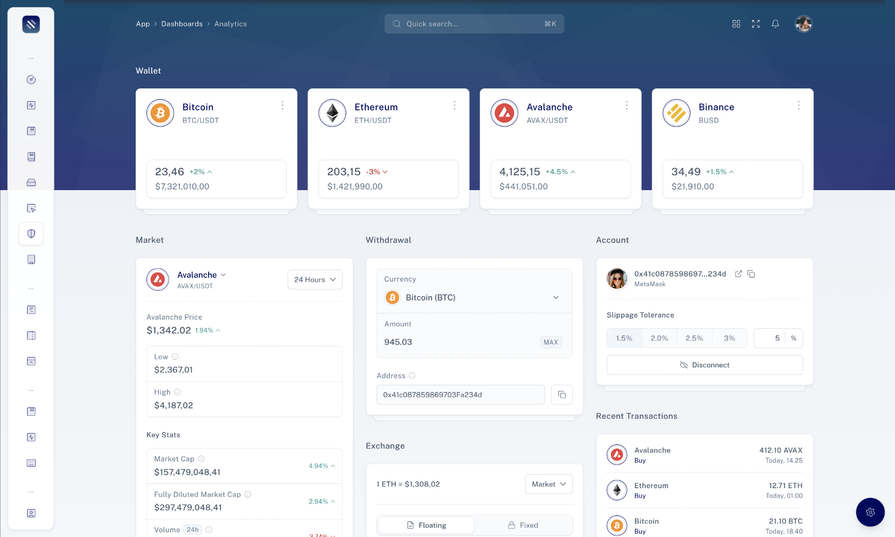
In this section, you will find detailed information about the available props, classes, and options that can be used with the component. Understanding these properties is essential for customizing and configuring the component to suit your specific requirements.

Below is a list of props that can be passed to the component:

Button
Prop Type Description
`as` `string` HTML element type for the button (default is "button" or "a")
`size` `Size` Size of the button ("sm" or "lg")
`variant` `Variant` Variant of the button style
`elevated` `boolean` Indicates if the button has an elevated shadow
`rounded` `boolean` Indicates if the button is rounded