The "Vertical Bar Chart" component allows you to visually represent data in a vertical bar chart format. Vertical bar charts are effective for displaying and comparing numerical data across categories or groups. This section demonstrates how to create and customize vertical bar charts using a popular charting library such as Chart.js.
Vertical bar charts are a powerful way to visualize data, making it easier to understand and compare values across different categories or groups. By following the steps above and customizing the chart to fit your specific data and design requirements, you can effectively incorporate vertical bar charts into your web application for data visualization.
The "Horizontal Bar Chart" component allows you to visually represent data in a horizontal bar chart format. Horizontal bar charts are effective for displaying and comparing numerical data across categories or groups. This section demonstrates how to create and customize horizontal bar charts using a popular charting library such as Chart.js.
Horizontal bar charts provide an effective way to visualize data, making it easier to understand and compare values across different categories or groups. By following the steps above and customizing the chart to fit your specific data and design requirements, you can effectively incorporate horizontal bar charts into your web application for data visualization.
The "Donut Chart" component is a type of circular chart used to display data in a visually appealing way. Donut charts are a variation of pie charts with a hole in the center, making them useful for displaying data distribution and comparisons. This section demonstrates how to create and customize donut charts using a popular charting library such as Chart.js.
The "Donut Chart" component is a type of circular chart used to display data in a visually appealing way. Donut charts are a variation of pie charts with a hole in the center, making them useful for displaying data distribution and comparisons. This section demonstrates how to create and customize donut charts using a popular charting library such as Chart.js.
The "Stacked Bar Chart" component is a powerful data visualization tool that allows you to display data in a stacked bar format. Stacked bar charts are effective for visualizing data with multiple categories and comparing the composition of each category across different groups or time periods. This section demonstrates how to create and customize stacked bar charts using a popular charting library such as Chart.js.
Stacked bar charts are a versatile way to represent data with multiple categories, making it easier to compare and analyze the composition of each category. By following the steps above and customizing the chart to fit your specific data and design requirements, you can effectively incorporate stacked bar charts into your web application for data visualization.
The "Line Chart" component is a valuable data visualization tool that allows you to represent data points as a series of connected data markers, forming a line. Line charts are effective for showing trends over time, making comparisons, and visualizing data with continuous variables. This section demonstrates how to create and customize line charts using a popular charting library such as Chart.js.
Line charts are a powerful tool for visualizing trends and patterns in your data. By following the steps above and customizing the chart to fit your specific data and design requirements, you can effectively incorporate line charts into your web application for data visualization.
The "Pie Chart" component is a popular data visualization tool used to represent data as a circular graph. Each data point is displayed as a slice of the pie, with the size of each slice proportional to the data it represents. Pie charts are effective for displaying data with a few categories and showing the relative proportions of each category within the whole. This section demonstrates how to create and customize pie charts using a popular charting library such as Chart.js.
Pie charts are a useful tool for visualizing the distribution of data among categories or showing the relative proportions of different parts within a whole. By following the steps above and customizing the chart to fit your specific data and design requirements, you can effectively incorporate pie charts into your web application for data visualization.
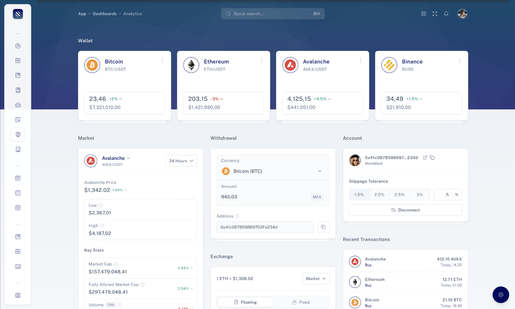
In this section, you will find detailed information about the available props, classes, and options that can be used with the component. Understanding these properties is essential for customizing and configuring the component to suit your specific requirements.
Below is a list of props that can be passed to the component:
| Prop | Type | Description |
|---|---|---|
| `type` | `string` | The type of chart (e.g., "line", "bar", "pie"). Defaults to "line". |
| `data` | `ChartConfiguration['data']` | The data configuration for the chart. |
| `options` | `ChartConfiguration['options']` | The options configuration for the chart. |
| `width` | `number`, `auto` | The width of the chart canvas in pixels or "auto" to use the parent container's width. Defaults to "auto". |
| `height` | `number`, `auto` | The height of the chart canvas in pixels or "auto" to use the parent container's height. Defaults to "auto". |
| `getRef` | `(el: ChartElement | null) => void` | A function that receives a reference to the Chart canvas element. |